

Bonnie’s Guide to Mixing and Matching Patterns at Home
You only need to take one look around here to see we take the art of mixing prints and patterns very seriously — as in we think it’s seriously fun.
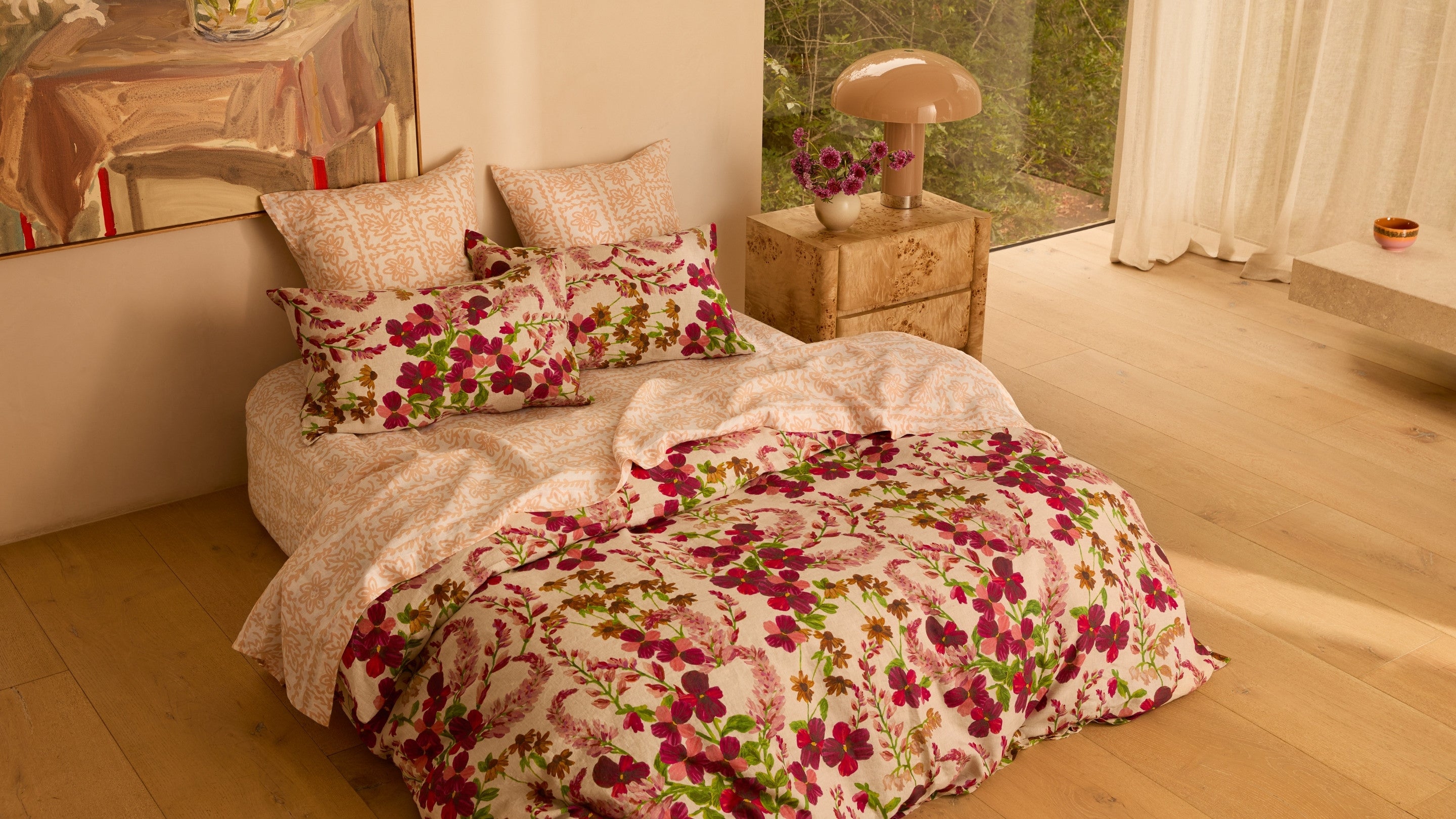
Prints and patterns inject warmth and energy into a space like nothing else. We’ve seen tired couches become cherished home icons with a scattering of printed cushions. We’ve seen table settings feel like you’re dining out rather than in, when the good printed tablecloth comes out. And we’ve seen beautiful printed bed linen trick us into believing we’ve just checked into a boutique hotel when we’re still at home.
Although mixing and matching prints by its very nature elicits bursts of creativity and fun, a good solid plan goes a long way to ensure there’s cohesion amongst the play, which is why we’ve enlisted Bonnie and Neil co-founder Bonnie Ashley to show us how to achieve the perfect balance.

Start with a tonal colour scheme
“I always start with colour and then I look at the pieces in the room as a whole – the artwork, the sofa, what colour the walls are painted – and work with this to put together a tonal colour scheme,” explains Bonnie.
“I find tonal palettes really calming and beautiful to live with but also love unexpected colour combos when pairing prints and patterns, such as really muddy colours with a beautiful khaki and citron green-yellow.”
Play with bright and muted tones
To avoid your colour scheme feeling too predictable, Bonnie suggests thinking of the tone through the prism of light and dark. For instance, mixing greens with blues, or magenta with burnt orange.
“Unexpected brightness with muted colours will make a print pattern feel lighter and more interesting,” she says.
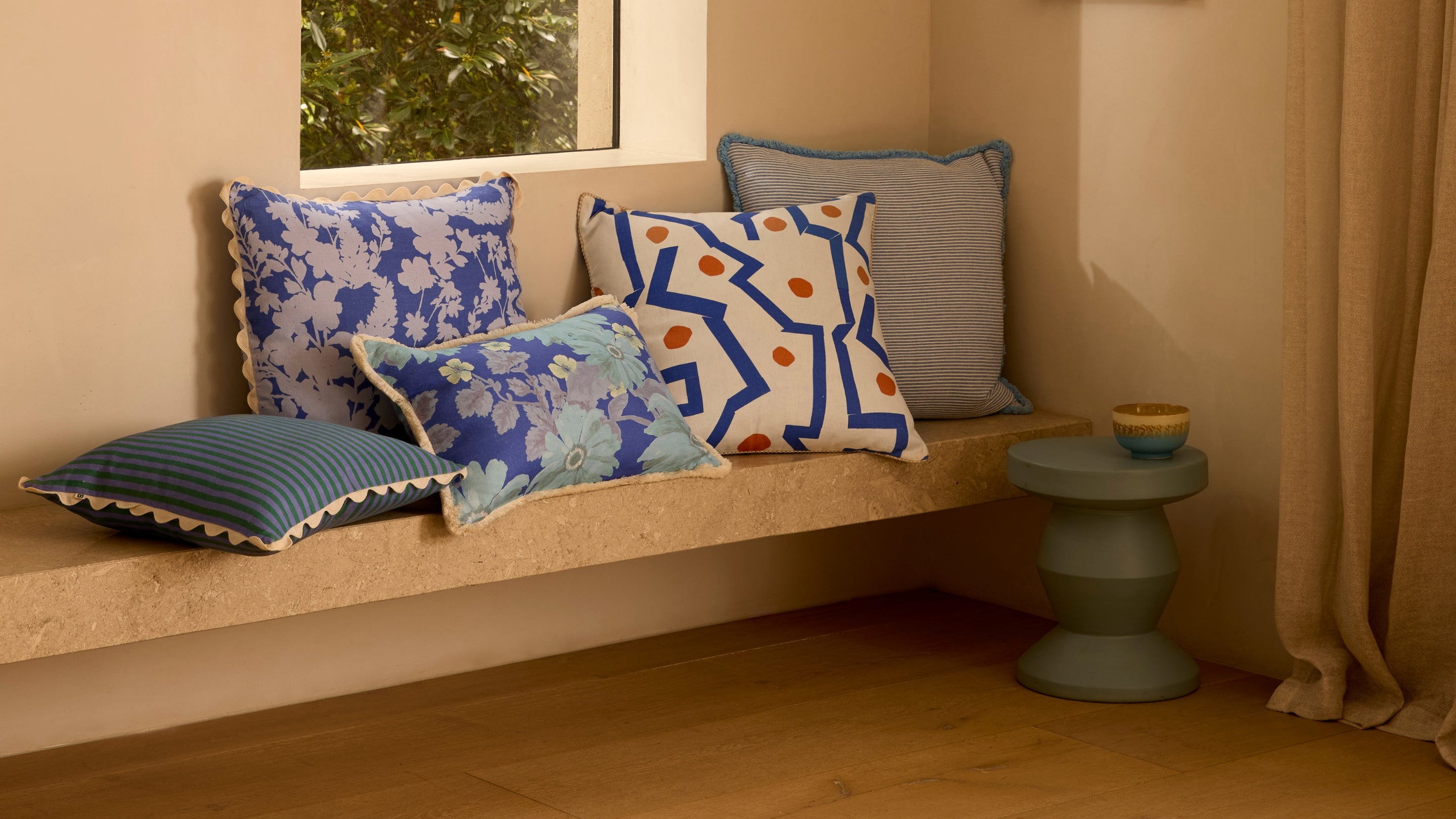
Choose a common design element
Whether it’s tonal, thematic, or even the same pattern in a different colour way – unifying your mix of prints and patterns with just one common element will create a feeling of cohesion.
“I think having a colour thread between printed and textured cushions helps and that could even just be the colour of the trim of the cushion, we always make sure when we add a trim to a cushion it links back to our wider Bonnie and Neil print collections,” says Bonnie.


Harmonise with stripes
Stripes are the diplomats of the design world with their ability to unite different prints and patterns in a flash, and Bonnie recommends we all have at least one striped cushion in our home collection.
“Stripes are a really good tie in design and help harmonise florals and geometrics together,” explains Bonnie.
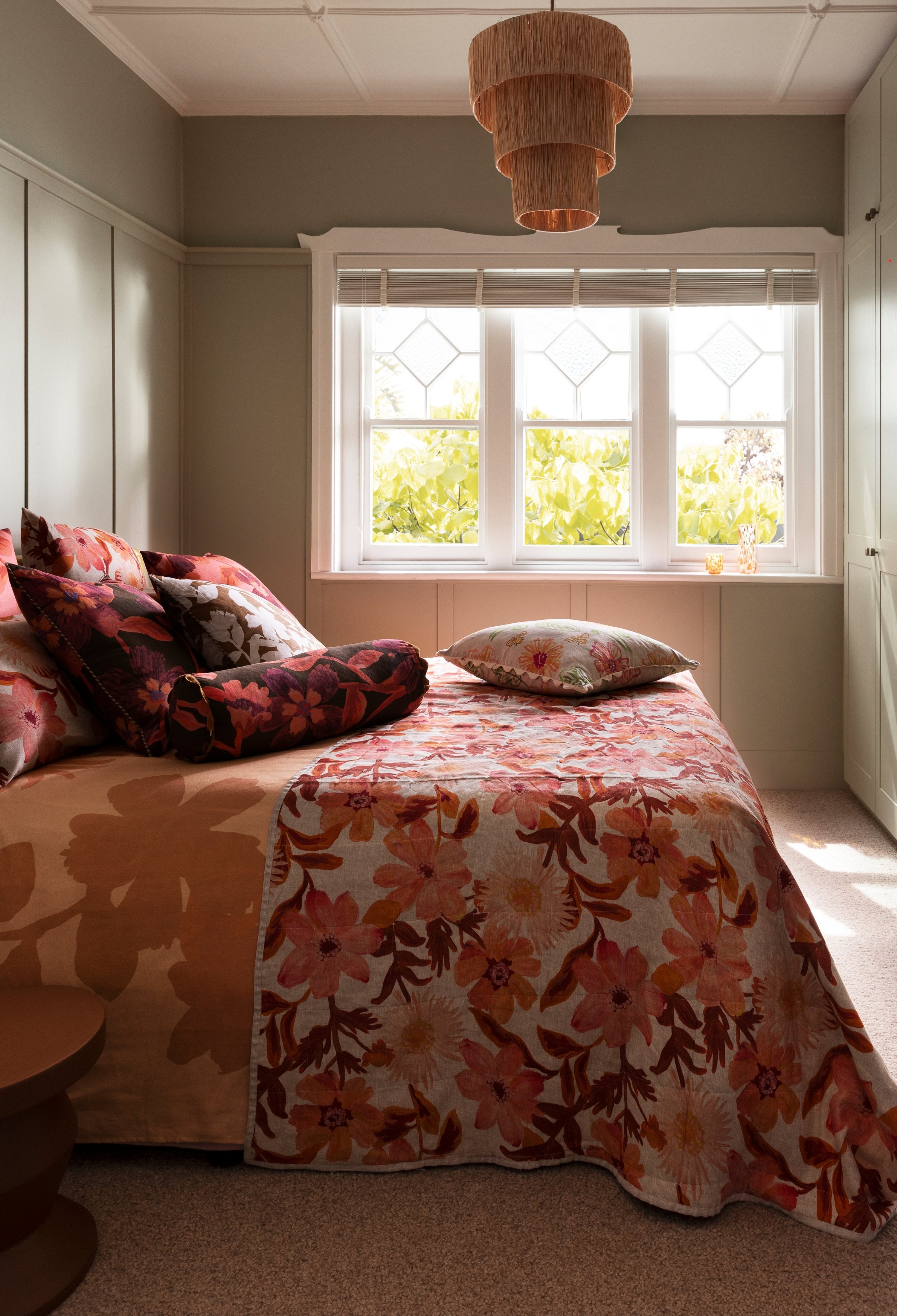
Play with scale
“I’m not a fan of having all small scale prints,” says Bonnie. “I love to choose a mix of small and larger scale patterns and oversized prints.”
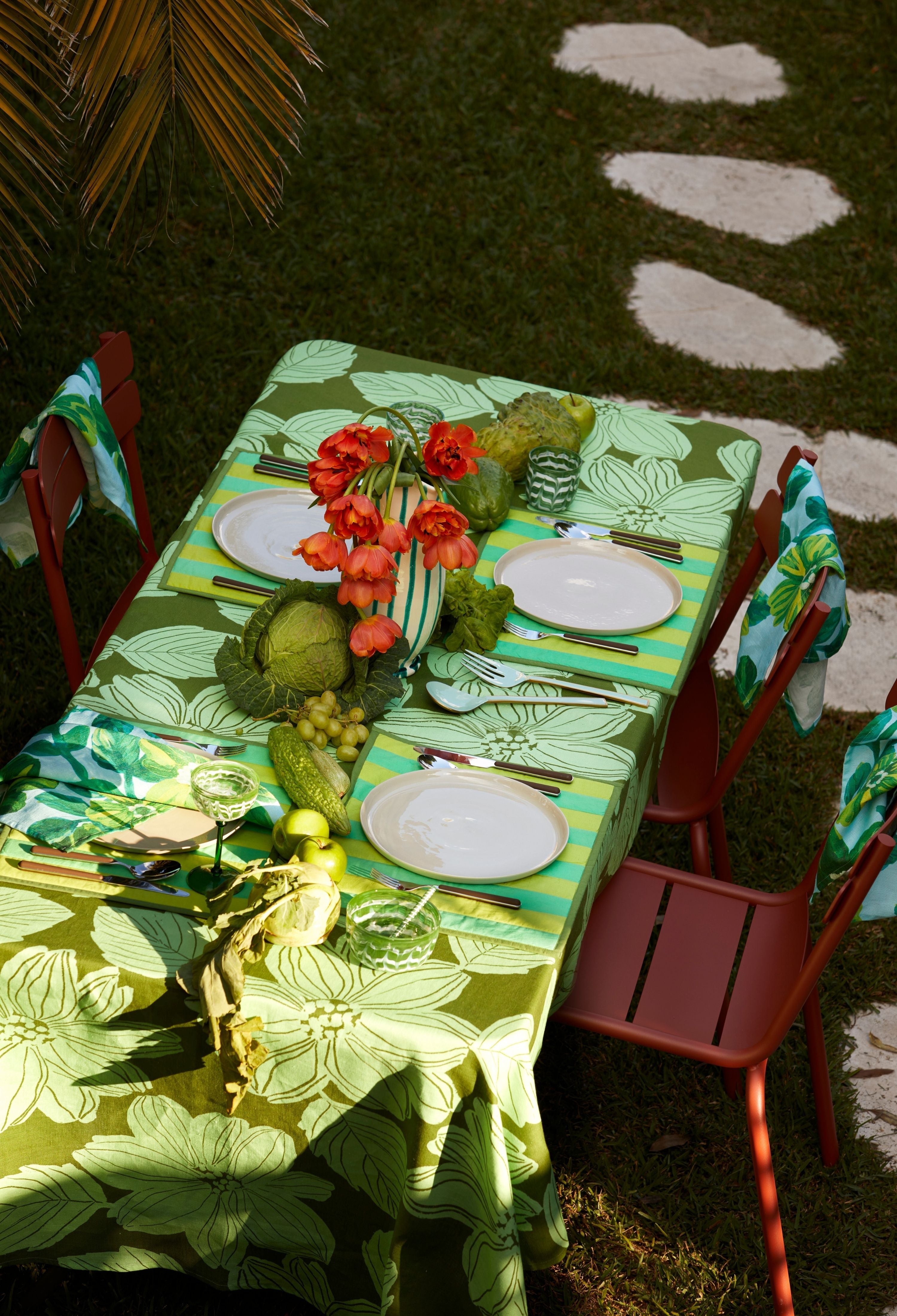
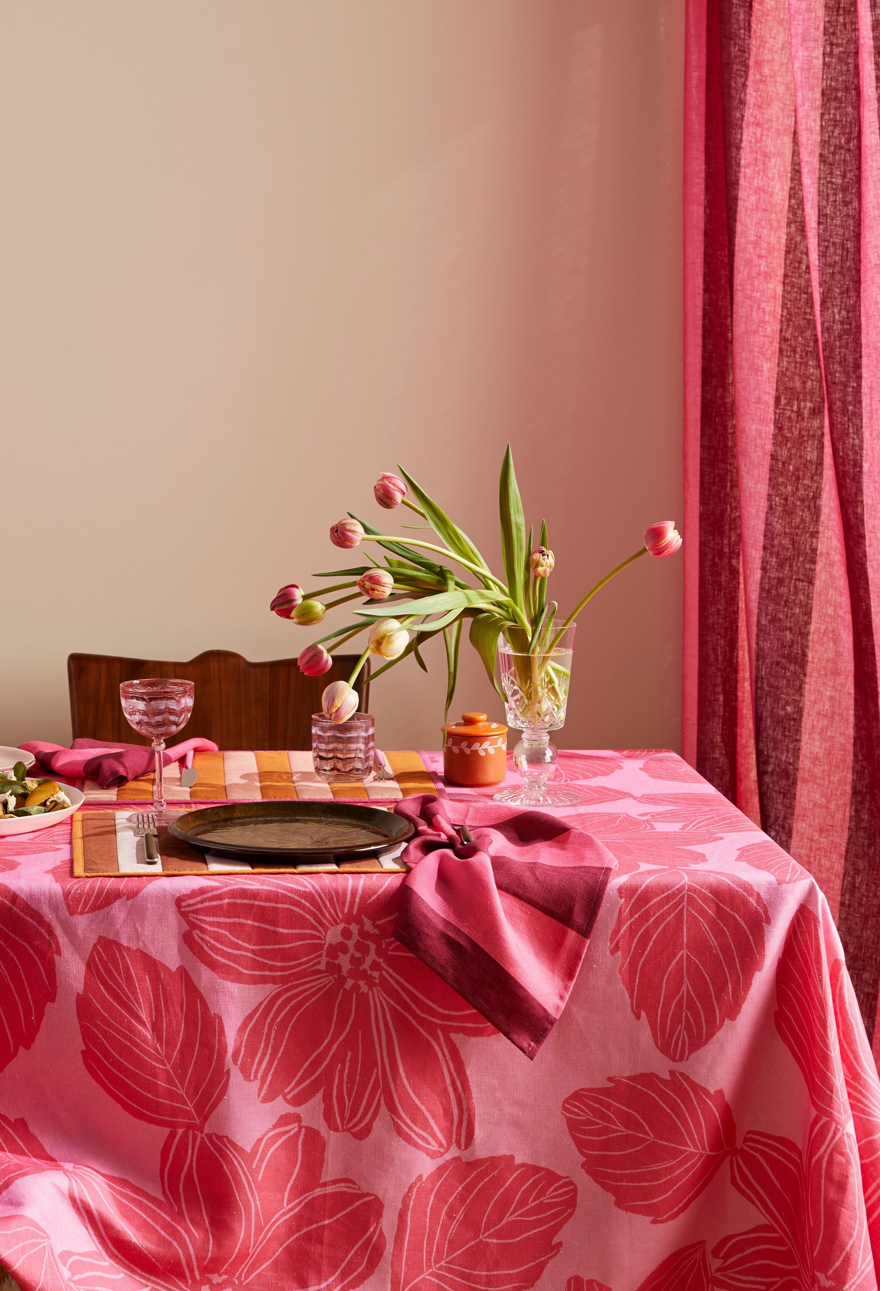
This advice works really well when you want to create a table setting that will have your dinner party guests whipping out their phones to commemorate the moment (while sending envy-inducing photos to their loved ones). To achieve this level of well-earned praise, we pair a beautiful printed tablecloth with contrasting napery in either the same print in a different colourway or with a bold, striped napkin.


Mix pattern with texture
If you’re after a more restrained palette but still want to experiment with prints and patterns, Bonnie is here to help.
“I think there’s sometimes this connotation when you say prints and patterns that it equals bright colours but that’s not necessarily true,” she says.
If you’re after a more demure tonal palette, Bonnie suggests mixing print and pattern with texture.
“I really love putting textured cushions (like plain velvets, boucle and cotton) with prints because it really allows the print to be the hero,” she says. “You can go quite neutral with prints, for instance a stripe and boucle cushion together in an earthy mustard and bone is a nice way of introducing pattern into a space.”

If you need help refining your cushion edit to suit your space, we’d love to help! Please get in touch here.
Photography by Martina Gemmola and Styling by Natalie Turnbull.
Read more
You don’t need to go on a holiday to feel like you’re on a holiday. You can achieve this same blissed-out serene feeling in the one place you always have access to: home. Here’s our Bonnie and Nei...
From bringing Euro summer to your backyard and curating playlists, setting the table, and channelling your inner florist, here’s our Bonnie and Neil guide to hosting the perfect dinner party.