
The art of a layered home
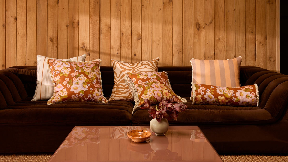
The most interesting homes rarely come together all at once. They are collected slowly, shaped by memorable pieces with stories we gather along the way. A cushion featuring a significant flower, a tablecloth destined for long lunches with friends, a colour that simply feels right. Over time, these individual layers begin to find a common language, and somewhere amongst them, a house starts to feel like home.
For Bonnie, decorating has always been instinctive. Her relationship with design is layered, connected to an inner style that speaks volumes in her craft and in turn, her personal spaces. “I love matching [colours], but I also love to mix and match” she recounts.
Rather than following a strict set of rules, she looks for dialogue, between colour, scale, pattern and mood to form a harmony, uniquely her own.


Follow the colour
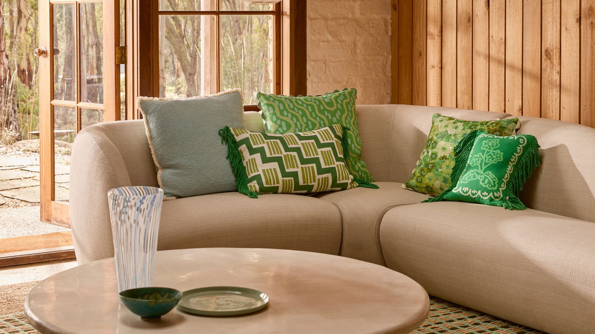
Colour is often the unifying thread that ties a room together, with external elements such as texture, pattern, or material falling into place around it. For Bonnie, she rarely considers colour in isolation, but rather, with the entire landscape that surrounds it. The sofa it will eventually sit on, the linen beside it or the flooring that will compliment it. She understands that designing a collection is one thing, but crafting an environment that someone wants to actually spend time in, that’s the real feat.
“I love this apple green,” Bonnie says, “it’s such a beautiful colour, I think on a cream [sofa], but also on brown as well.”
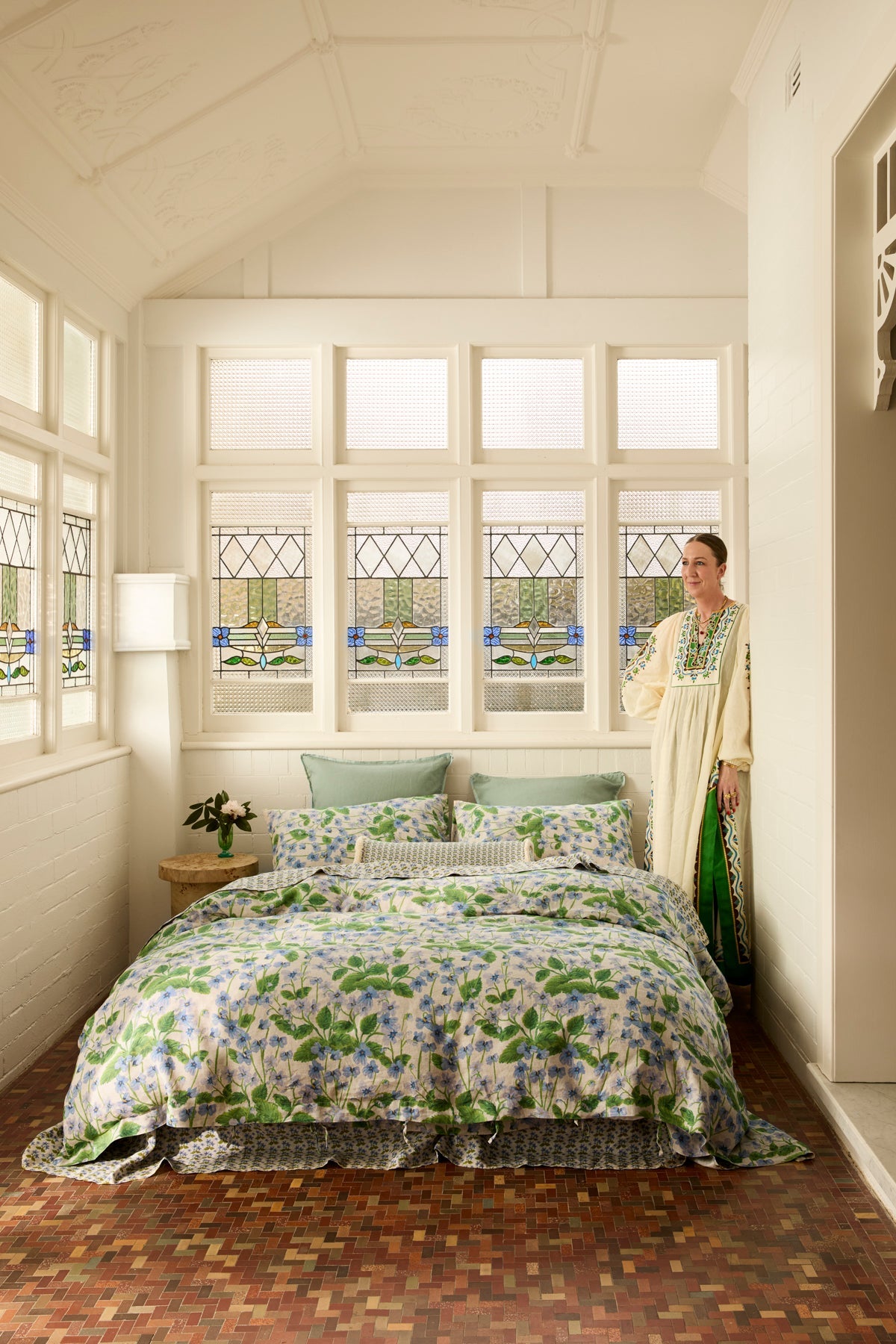
It’s an approach that looks beyond simply finding colours that match. A shade can feel entirely different depending on what it sits beside, and sometimes the more unexpected pairings are the ones that bring a room to life. Soft lilac finds a natural companion in blue — “blue and lilac is just such a pretty combo” — while blue and green offer something a little more unexpected. There’s an old saying that blue and green should never be seen, but it’s a decorating rule Bonnie is more than happy to leave behind. “I don’t believe in it because I think it’s a gorgeous combo.”


Perhaps that’s where the most interesting colour stories begin, not by following a formula, but by noticing the shades that naturally speak to one another. A soft green pulled from the leaves of a floral, a periwinkle blue echoed in a trim, or a quieter neutral providing brighter colours with a place to rest.
When there’s a common thread running between them, colours don’t need to be apart of the same family, or blend together perfectly, to feel at home together.
Play with scale
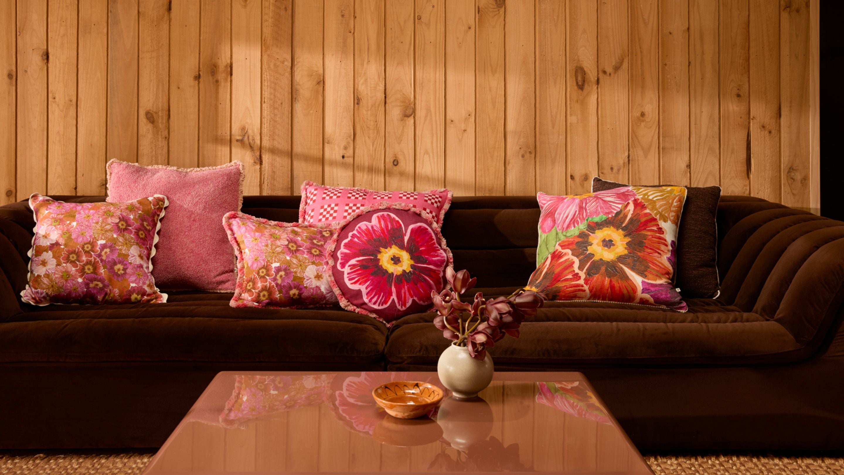
Interestingly, colour finds a close friend in scale, the two working in harmony to create pairings that feel balanced in your room. Think of it like this, if colour is the driver for connection and feeling in the space, then scale’s role is to create visual interest and dimension. Together, they’re the perfect pairing and a medley that sits at the heart of all of Bonnie’s collections.
The secret, Bonnie suggests, is in finding the thread that ties everything together. An “oversized print, paired back with something in a smaller scale” creates an interplay between the two that feels light yet sophisticated. It’s a tension that when combined has the sort of opposite effect and allows the patterns to relax into their environment.
Repetition, however, doesn’t have to mean sameness. Sometimes, the most considered pairings come from taking a familiar motif and simply seeing it from a different perspective.
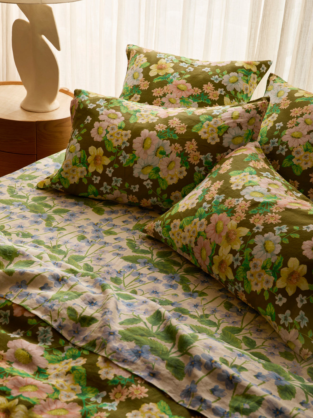
Delilah explores this idea through the Primrose, reimagining the same flower in an oversized scale and allowing it to sit alongside its more delicate counterparts.
“The thing I like about this pair is they both use the same motif, but just in a different scale,” Bonnie explains.


It’s an idea that appears throughout Bonnie’s collections; A flower revisited, a colour carried from one print to another, or a motif transformed through scale. Rather than introducing something entirely new, sometimes it’s simply about expanding on the same story.
Layering the bed
When we move to the bedroom, we see these principles begin to overlap. The painterly strokes of Buttercup Rust sit against Petit Madeline Pink’s smattering of delicate flowers, the contrast in scale forming the first layers of a considered pairing. Colour joins the conversation with bold amber hues, folded over cerise pink, to create a tonal thread connecting the two.


And there’s really no rules with this. Rather than having a set formula, Bonnie looks for what feels instinctively right; “ I would do the Buttercup Rust in the sheets and then the Petite Madeleine in the duvet cover [but] I also love the Petite Madeleine on the sheets, and then all the pillows and the duvet cover in the Buttercup Rust.” Its a reminder that the way you decorate your space should feel personal, a reflection into who you are and what makes you tick.
Let the print inspire you
If however, you are in doubt about where your own styling kitsch sits, it may be nice to look a little closer at the print itself. Often, the answer to what should sit alongside it is hidden amongst the brushstrokes.
Petite Madeleine Blue is a perfect example. Set against a soft oatmeal base, its scattering of florals carry subtle notes of ochre and vibrant blue, opening the door to a much broader palette. “It has so many beautiful undertones and colours in there that it makes it really versatile,” Bonnie explains. “You can style it with lots of different colourways.”
It’s a simple way of taking the guesswork out of mixing colour. Follow what is already there, allowing the smaller details within a print to wander beyond its borders and into the rest of the room.


So perhaps the secret to a layered home is not matching everything perfectly as we once were taught, but rather, finding the thread that connects it all. A colour picked from a hidden floral, bold motifs layered to create harmony, and tonal pairings that were once taboo, that may really just speak to you.
Because a home layered with colour and pattern needn’t feel overwhelming. When there is character underneath it all, adding more can feel beautifully calm.
Photography by Martina Gemmola
Read more
Our hand-painted garden florals are finding their way onto French linen bedding. Soft layers, slow mornings, coming soon.

There is something about the first signs of spring that has Melbourne stirring awake.